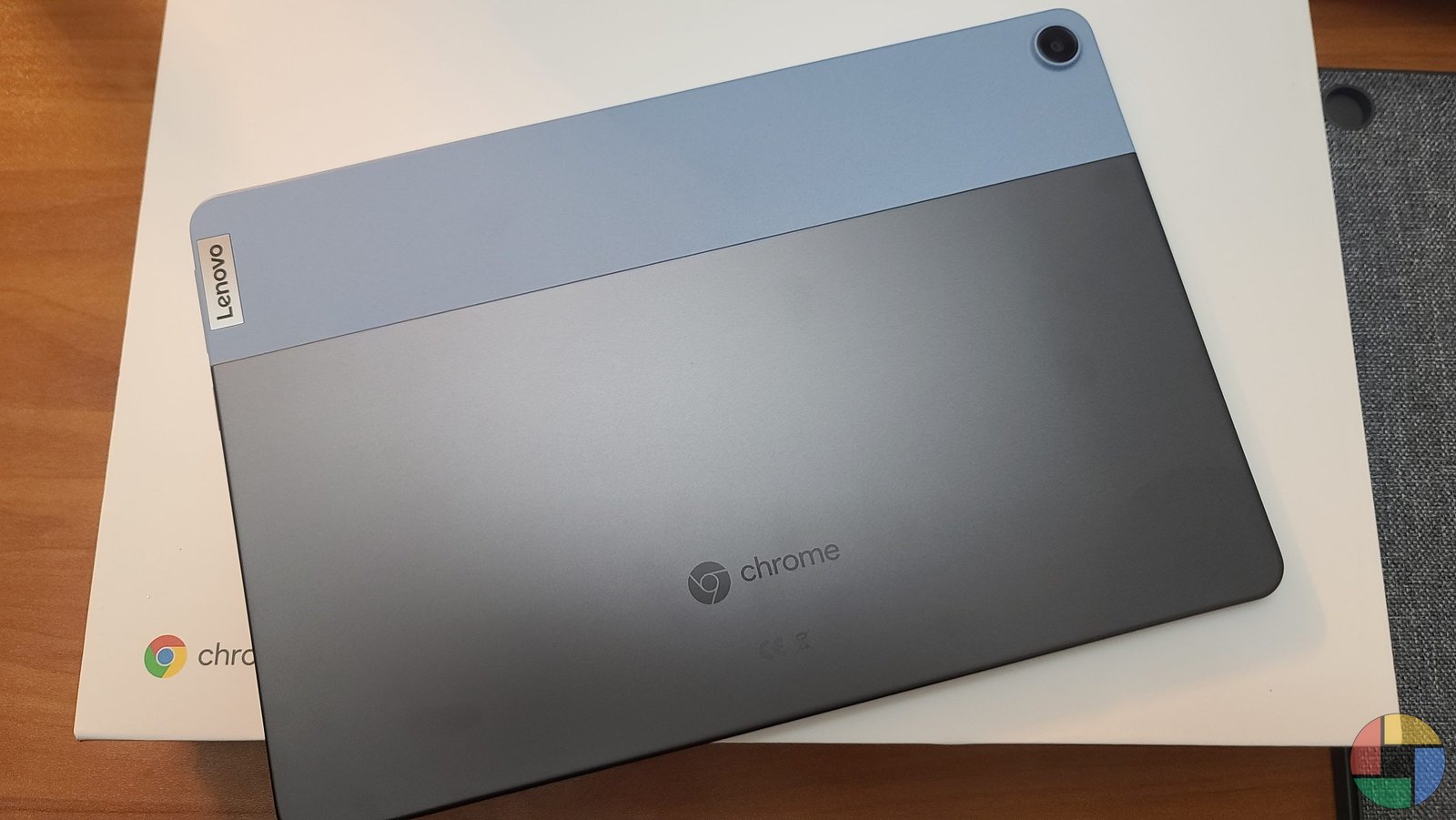
We Finally Got our hands on the Ideapad Duet
What is the Lenovo Ideapad Duet? Its an extremely portable chromebook 2-in-1 detachable with Google’s tablet optimized UI.
So, back at CES 2020, Lenovo launched a slew of devices from laptops to smart displays. Two of those devices, the Ideapad Duet and the Ideapad Flex 5 really stood out from the pack. Both sparked my interest but the Ideapad Duet was something we’ve never seen in a Chromebook. A small and portable well-built Chromebook.
Now its six months later and I’ve finally been able to get my hands on one. After 24 hours here are my first impressions.
Duet Specs:
- Screen: 10.1-inch 1920×1200 display
- Processor: GHz MediaTek Helio P60T
- RAM: 4 GB
- Storage: 64GB or 128 GB
- 1x USB-C port, volume and power buttons (no headphone jack)
- Camera: 8 MP rear, 2 MP front
- 802.11 a/b/g/n/ac, Bluetooth 4.2
- Includes detachable keyboard and detachable kickstand
- $279 (64 GB), $299 (128 GB)
After finally seeing the Ideapad Duet in person I’m very impressed. The build quality is more than you would expect from any computer under $300 let alone a Chromebook. Lenovo has done an excellent job of giving this tablet a premium feel. This includes the cover and the keyboard accessories that come in the box. With all the accessories attached the design looks similar to the Surface Go without the thickness. The only major difference is that the kickstand is attached to the cover instead of directly to the tablet itself.
The first thing you notice is that the tablet itself is light. Lenovo really went all-in on keeping this tablet portable. The only real port you get one USB-C for charging and data. No headphone jack or USB-A. There are pogo pins at the bottom for the keyboard connection but that’s it. Minimal is what Lenovo was going for here. When you compare this to an iPad or something like the Galaxy Tab S6 it makes perfect sense. Most tablets have similar profiles and only have one connection port.
The 10.1″ 1920×1200 screen is great for the price. It’s bright and crisp and the bezel is sitting at a good size for a tablet. Everyone wants no bezels but anything larger than a phone needs two hands and a good size bezel. Touchscreen accuracy is good but it’s hard to always hit your mark on a screen this small. Pen input is there for USI Stylus but Ill have to find one for the review. After using Samsung’s Galaxy Chromebook and S-Pen, I’m going to say that any Chromebook marketing itself as a productive or professional computer has to allow some kind of stylus input.
The keyboard crams in everything you would see on a much larger Chromebook. My fingers don’t have to travel far to hit any keys. I started writing this post on the Ideapad Duet but switched over to a much larger keyboard to fix all the typing errors. By the time I post my full review, I should be much more proficient, but we will see. The keyboard doesn’t have a backlight. This was another way they could keep the price down. Without a backlight, I don’t see myself typing anything lengthy on this small keyboard.


Flip the keyboard around and this is where I think the Duet will really shine. Media consumption and web browsing will probably be its bread and butter. I haven’t had to charge it since the first charge I gave it out of the box. Battery life should be very good considering the low resolution combined with Chrome OS.
My first impressions of Lenovo’s Ideapad Duet Chromebook are pretty good. Clean minimal design with all the right boxes checked for a Chromebook tablet. There is a lot still to cover like sound quality, multitasking, and how it all compares to the other Chromebooks and tablets but Ill save those for my full review.
Lenovo’s own site says coming soon. I ordered mine from Best Buy where it’s currently out of stock. Keep checking Chrome Daily for the full review and availability updates.


